Does the Upside Down Twitter Logo Look Like Sonic? An Investigation
Credit to Author: Sarah Emerson| Date: Fri, 10 Nov 2017 16:00:00 +0000
Sometimes reporting leads you to new, and unexpected places—stories that you didn’t anticipate, but that reveal themselves in time.
Yesterday I wrote about Twitter’s broken verification process. The company is facing new opposition after verifying Jason Kessler, organizer of the violent Unite the Right rally in Charlottesville, VA.
Motherboard frequently covers Twitter, and it’s always been a struggle to find compelling, high-quality artwork to illustrate our stories. Looking at past articles, I think we’ve done a pretty good job at finding (or creating) original images for this subject. Stock image repositories are full of sad, tragic Twitter photos; my least favorite genre being the photo-taken-of-computer-screen variety.
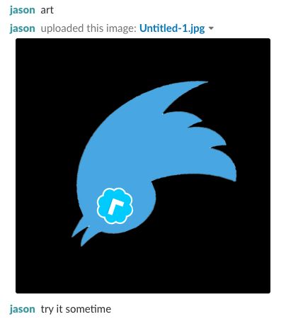
So before publishing my story, Motherboard editor-in-chief, Jason Koebler, and I were debating what kind of artwork to use. Jason came up with a clever idea that I admittedly stole and improved upon.
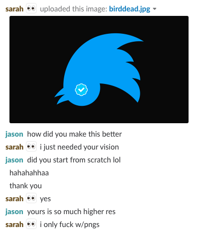
It’s an upside down Twitter logo with a checkmark for an eye. Very nice and subversive.

I’m not terrible at Photoshop, so I made the image higher-resolution, and horizontal, which our CMS likes.
Much better.

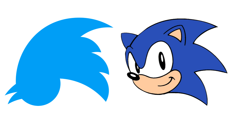
I obsessively checked the responses to my story after it went up, as one is inclined to do. Almost immediately, people started telling me the Twitter logo, when upside down, looks exactly like Sonic the Hedgehog. Does it? Yes. Yes, it does.
When you place the images next to each other, you can really see what I’m talking about. The blue. The pointy prongs. The chin area. The nose and/or beak.

I’m not conspiracy minded, but they look so alike. It makes you think. And all art is derivative, or whatever, so let’s take a look.
Sonic the Hedgehog first came out for Sega Genesis in 1991. But, once, he was envisioned by Sega designer Naoto Ohshima as a character code-named “Mr. Needlemouse.” This early iteration appears much more similar to the Twitter logo than today’s Sonic. Old concept art for the character shows cartoon-ier versions, too. Sonic has always been blue. He is also on Twitter.
Twitter’s oldest logos, meanwhile, were its name in bubble font. Eventually, Twitter adopted its iconic bird form. It was, according to AdWeek, “an iStock bird by artist Simon Oxley whose rights were acquired for about $15.” The logo was later perfected (much like I did with Jason’s artwork), before being re-released in 2012. Also, its name is “Larry.”
Now, it’s important to note that Oxley’s bird design does not look like Sonic. Only once it was adapted (by Twitter co-founder Biz Stone), did it take on a Sonic-esque silhouette. And it only looks like Sonic when upside down.
I reached out to Stone on Twitter, asking if he had thoughts about the similarity. Maybe he was subconsciously inspired by the Sega character? As of this story’s publication, he has not responded.
I also asked a Twitter spokesperson about the logo’s origins, pointing out the Sonic comparison, which they “lol-ed” at.
Some people also think Twitter’s icon looks like Batman. Which, from a certain angle, yes, I agree it does.
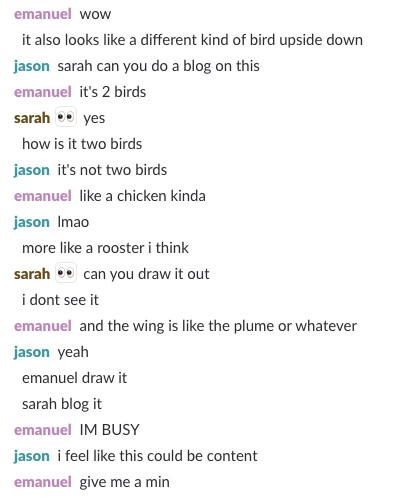
Back at Motherboard, editor Emanuel Maiberg suggested the logo might not be one bird, but two birds.


Twitter’s rules about using its logo explicitly state: “Don’t alter, rotate, or modify the logo.” This seems weird. It’s not the American flag. What is Twitter trying to hide?
Whatever the case may be, this was an interesting exercise in what our eyes are trained to see. I’m sure there’s also something profound here about brand recognition, but I don’t really feel like thinking about that.
Do you agree that the upside down Twitter logo looks like Sonic? Or do you think I’m crazy? Send me an email at sarah.emerson@vice.com.